Hold Me Closer Cloud Dancer
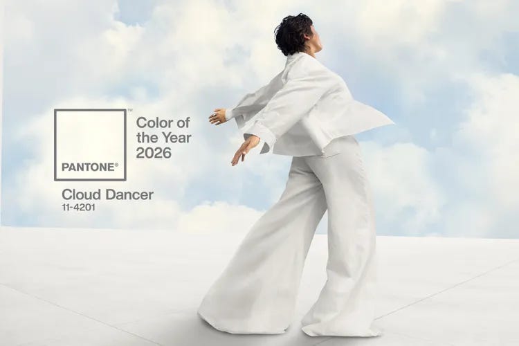
Good news, friends. The wait is over! The incredible minds at the Pantone Color Institute (actual job) have announced the 2026 Color of the Year: Cloud Dancer. Say it again, but with more of a whispery effect: Clouuuuddd Dansssserrrrrrrr. The Pantone people will know if you’re not saying it correctly! Their spies are everywhere because they are colorists and know how to blend!

Pantone is an American company that got its start in the commercial printing industry. A man named Lawrence Herbert, working as a part-time employee, applied his knowledge of chemistry to simplify and systematize the stock of pigments and other colored inks in the company’s print roster. This was 1956. What else was he going to do on his lunch break? By 1962 Herbert was master of the ink and printing domain, turning a tidy profit for the company. Recognizing a cash cow of a different color, Herbert bought the ink and color technology from the founders and rebranded them as “Pantone.” This is a word that comes from the Greek prefix “pan,” which means “all” and the English “tone,” meaning “hue.” Hence Pantone: “all colors.” And when Herbert got potted at the company holiday party he would make all kinds of dumb innuendos about his “PANTS tones.” Herbert may have been a colorist genius, but he did not do well with ladies or the mens.
Eventually Pantone became known for its groundbreaking system to standardize and categorize colors. These are collected into Panton Color Guides that consist of cardboard or plastic strips featuring a series of related color swatches, arranged in a fan or chart. One strip might have five different shades of blue, for instance. I realize this sounds like the kind of project you give a hyperactive 5-year old to occupy them for a half hour. But what it does is enable any kind of designer–textiles, clothing, products, housewares, technology, and just about anything getting manufactured–to match a specific color in the production stage no matter what type of equipment is used to produce the color itself. They call this the Pantone Color Matching System or PMS, an unfortunate designation. Though if PMS were a color it would be this:
You’ve most likely encountered Pantone’s sorcery when you’ve picked out colors to paint a room in your house. We had our bathroom redone last winter and agonized over Cotswold Morning, On the Moors, Thistle Burr, Booth Bay, and Childhood Winter Memories at Tinsbury Farm Moments Before the Vicar was Murdered. It’s grey. Our bathroom is grey.
Since 1999 Pantone has announced a Color of the Year. This is the Big Dance. Over the course of a given year, a highly select committee of individuals convene twice. They meet at a European capital in complete secrecy (Shhhhh! But, c’mon, it’s obviously Paris); there are complicated handshakes, code names, impossible riddles, and passed canapes (usually popcorn shrimp and mini beef wellingtons…TELL NO ONE!). The people come from all over the world, representing art, fashion, design, technology, entertainment, and culture. After several days of debates, presentations, and blood oaths, the group chooses a color to set the tone and tenure of the upcoming year.
The designated shade carries a lot of significance. It not only influences merchandise across every market and industry, but it’s also meant to define a certain type of emotional, philosophical, and cultural ethos. In a way, the Pantone Color of the Year is the hue equivalent of focusing on a word or phrase to define your mindset for the next 365 days. But unlike a word or phrase that you will write down on a piece of really nice paper intending to tack it above your desk only to accidentally toss it in with the holiday recycling and forget it the way you also forget most of your passwords, a color is visual. Much easier to track. And it allows you to justify big purchases like a new sound system or pure bred show dog in the Pantone approved hue.
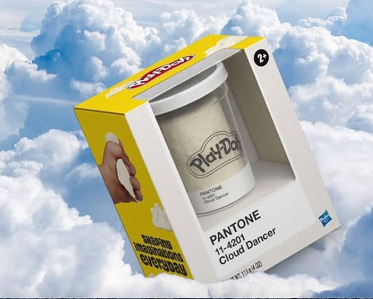
Back to the 2026 Color of the Year, Cloud Dancer: it is white. Laurie Pressman, the VP of the Pantone Color Institute, describes Cloud Dancer as “an airy, white hue” consisting of a delicate blend of warm and cool shades so as not to come across as sterile. No Cuckoo’s Nest White here! Pressman goes on to state that Cloud Dancer “signifies our desire for a fresh start, opening up a space for creativity, and allowing our imagination to drift so that new insights and bold ideas can emerge and take shape.” It is a “conscious statement of simplification” and provides “release from the distraction of external influences.” This color evokes reflection and calm in a world marked by consistent, ongoing turbulence.
Sold. Take my money, Pantone.
The Complaint-o-Sphere kicked into overdrive on this one. People called the color choice bland, boring, uninspired, and racist. “Choosing the color white during this social and political climate really says something,” commented Jason Rhee, designer at the Rheefined Company, on social media. Please. We just got through Starbucks Red Cup day without any manufactured hysteria. Can we never have nice things, like, ever?
I say how bad are things when it’s THE COLOR EXPERT PEOPLE RIDING IN TO TRY AND SAVE US? Besides, the 2025 Color of the Year was Mocha Mousse–brown, the shade of a particular organic matter that a lot of us felt buried under and are still shoveling for our lives. Pantone owes us. And, honestly, at the end of this Mocha Mousse sandwich year, I’m too exhausted to resist. I can hear them speaking softly in that same measured tone as the pod hive mind people in Pluribus:
We only want what’s best for everyone. A reset. A return to calm. A collective lobotomy. Your color is your own as long as that color is Cloud Dancer. All forms of payment accepted.
Fa La La La GIFTS!
You might be reaching the holiday gift buying panic threshold already. I see you! In another week I will be you. Yes, I’m about to shill my books. BUT! I encourage you to support any kind of craft/creative enterprise this season. Books, visual art, music, textiles, woodworking, gift subscriptions to indie ‘zines, Substacks, or small presses; passes or memberships to museums, arts/culture/music venues. There’s tons out there. And as technology lurches along, it’s going to become more and more crucial to back human made stuff. Grazie, grazie, grazie! End of TED Talk.
Grab & Gift from moi:
Boston and Beyond: Discovering Cities, Harbors, and Country Charms (Globe Pequot) This is my love letter to New England. It features my photography and writing spotlighting a ton of interesting, unique destinations and locations in Boston and within an hour or less from the city. Great for regional interest and armchair travel!
The League of Extraordinarily Funny Women: 50 Trailblazers of Comedy (Running Press) Who doesn’t need a laugh these days? Fifty funny broads have you covered. You’ll find treasured icons (Lucy, Lily, Amy, Whoopi, Tina oh my!) and hopefully your next favorites (Tig, Aparna, Mae, Jessica, Nora!) spanning over a century of comedy in all its forms—stand-up, film, sketch, literature, TV and more. Engaging, enlightening profiles with gorgeous portrait illustrations—perfect coffee table, night stand, pick up and read anywhere kind of book for the humor lover on your list (appropriate for tweens, too!)


Love this!
Only a guy with two first names would invent the Pantone. I imagine he was a bit OCD?
Love your made up colors. Haha.
I always thought it would be fun to work for lipstick and nail polish companies and create new names. I’ll add the Pantone company to the list. BTW our last house was Agreeable Gray. Hubby and I got along famously. Hehe.
*At the meeting (probably):
Manager: "F it. Let's just go with white."
Lackey: "Doesn't white denote the absence of color?"
Manager: "Not if we give it a cool name, it won't."
Lackey: "Brilliant! I'm on it!"